Gold and yellow have been chosen to symbolise the colours of Thailand in a new ‘Colours of the World’ campaign by paint manufacturer Dulux. In an email interview Dot Property Group discovered more about the campaign, why Thailand was chosen to be part of the campaign and how gold and yellow were picked to represent the Kingdom.
What is behind the ‘Colours of the World’ concept?
‘Colours of the World’ is a colour concept inspired by well-loved destinations and their characters. ‘Colours of the World’ provides a range of nine exciting new palettes that bring the feel of various parts of the world into your home. The ‘Colours of the World’ palettes include Energizing Thailand, Wild Africa, Amazing Australia, Romantic France, Modern Hong Kong, Zen Japan, Relaxing Maldives, Refreshing New Zealand, and Passionate Spain. Each has been designed to reflect the personality of each country and stimulate the imagination of consumers so it is almost like they have been there.
How did the concept originate?
At Dulux we believe that colours can inspire and evoke emotions and have an impact beyond what the eyes see, as colours can be inspirational especially when used around the home; where families spend a lot of time bonding together. Families also spend time together when travelling and these new colours have been inspired by popular destinations around the world. Family vacations are remembered more vividly than many other life events, according to research by the U.S. Travel Association. The ‘Colours of the World’ concept hopes to inspire imagination of desired or past family holidays, making the home more uplifting and stimulating for everyone.
How many shades does ‘Colours of the World’ have?
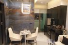
Each of the nine destinations has its own palette made up of six complementary colours giving a total of 54 exciting shades. The new Energizing Thailand palette, one of nine exciting new palettes from Dulux’s Colours of the World collection, introduces new gold and yellow tones found throughout Thailand, from the gold of the temple chedi to the brightness of the famed Thai smile.
Who chose Thailand as one of the destinations?
Research showed that Thailand is among top popular destinations voted by consumers. Moreover, having operated in Thailand for nearly 50 years, AkzoNobel is able to capture the vibrancy and distinctive characters of the country and translate them into a new colour palette to inspire homeowners. For example, the sense of the warmth of Thai culture reflected in Thai temple’s architecture has been translated into different uplifting shades.
Why does Thailand represent gold and yellow tones?
The tones in the ‘Energizing Thailand’ palette capture the vibrancy and sparkle of Thailand’s character, giving a sense of the warmth of Thai culture by providing six uplifting shades representing everyday colours found throughout Thailand, from the gold of the temple chedi to the brightness of the famed Thai smile. ‘Energizing Thailand’’s shades include King’s Ransom, Sunspot, Peruvian Yellow, Orian, Coconut and White Room. These vibrant tones can be applied to any room around the house, from the living room to the bedroom.
Which product does ‘Colours of the World’ feature in?
‘Colours of the World’ is latest introduction to the Dulux Inspire range. Dulux Inspire features Chroma Brite technology which helps keep walls free from stubborn stains, giving long-lasting colour durability. It is available in matt finish and new semi-gloss finish.
Where can Dulux fans see all new 54 colours and find out more information?
All colours are available in the ‘Dulux Visualizer’ application, a free mobile app that allows home lovers to see it before it is done to renovate home with confidence. More information can be obtained from the Dulux Colour Design Center on +66 (0) 2770 6333 and www.dulux.co.th.