From window orientation to how a room is used, many factors play a role in how colour is perceived in a home. While choosing a room colour is a deeply personal choice, it’s helpful to understand how certain influences can help guide paint colour choice.
In this column, Noelle Parks, a professional interior designer for Dunn-Edwards Paints, shares expert tips on finding the right hue:
Choose a colour based on desired mood of a room
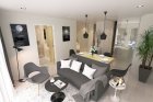
From high-energy red to mellow blue, psychological responses to colour inform effective and stimulating home design. Consider the ambience of the room before choosing a color – will it be a lively dining room, a peaceful study or a luxurious bedroom? Warm tones like red, orange and yellow evoke energy, playfulness and action – great for spaces for interaction like dining rooms or kitchens. Cool tones including green, blue, indigo and violet shades create tranquil and soothing environments. Try cool tones for places of relaxation and meditation, like the bedroom.
Use neutral colours as a base that can blend with other colours
Neutral colours pair well with many shades. White, the most neutral of colours, gets along with almost any other shade. Crisp and elegant, white opens up spaces and provides a clean, well-designed look. Brown keeps colour schemes grounded with its earthy tones and works best with an accent colour. Black adds drama and is often used as an accent to embolden other tones.
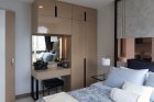
Consider how lighting changes the perception of colour
Colour looks different on a swatch in a store or on the wall at home at different times of day with different amounts of light. It’s imperative to test colours under the lighting conditions at home to see how the paint will truly appear. If a room gets a lot of sun, a light, cool colour may brighten up a room. If there is a lot of natural sunlight, consider painting a deeper, richer colour for a serene look.
Pay attention to the details in a room
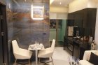
Permanent features like the flooring, architectural trim, moldings and columns will affect how colour appears and blends with the rest of the room. For example, dark flooring will go well with lighter wall colours as opposition creates interest and visual excitement. The design on a large piece of furniture may inform the colour choice of the overall room.
Determine warm or cool tones based on climate and window orientation
Typically, warmer colours are more acceptable in cold climates and cooler colours in warmer regions. A south-facing window orientation suggests a cool to neutral colour preference, while a north-facing window suggests the use of a warmer colour
Put colours to the test
Test how natural and artificial light will affect the colour by painting a two by two-foot sample on different parts of the room that gets different amounts of light. Try sampling various shades of one colour. Live with the colours for a few days and see which hue best expresses the original vision.